SenseIT
4/20/2022
Lexend – A Font for Everyone

In a world plagued with an overabundance of choice, it wasn’t obvious which typeface to use when redesigning SenseIT’s website. Traditional fonts are perhaps the default, but as a company that values the user experience for our clients’ products, we wanted to be mindful of each design choice we made for our own user interface. As a business that deals in digital accessibility, it was important to us that our website walk the walk, so to speak. That’s why we opted for a font that was designed with inclusivity at its core. Because when design is done in a thoughtful and inclusive way from the outset, it sets the tone for everything that follows.


A Brief History of Font Design
Modern typography dates as far back as the invention of the printing press in 1439[i]. But digital font design became common only in the mid-1980s when personal computers first allowed type designers to create typefaces digitally by using commercial graphic design software[ii]. Trends in typography have typically balanced the competing influences of legibility and popular hand-lettering styles of scribes, but as the digital age advanced, simpler styles have tended to win out.
Three governing principles of typography are:
- readability
- legibility
- aesthetics[i]
Readability refers to how easy the text is to read as a whole, including page margins, spacing between lines and words, etc. It refers to the reader’s comprehension of the meaning of the text. Legibility, on the other hand, refers to the perception of individual characters and how easily readers are able to distinguish between one character and another. Both readability and legibility support the aesthetics of a font, and typographers strive for excellence in all three areas.
How Lexend Came to Be
LEXEND[i] was founded in 2000 by an Educational Therapist named Bonnie Shaver-Troup, EdD[ii]. In her work with patients, she noted that reading issues were masking patients’ true abilities and sought to correct for that. She wondered if the typographical factors in a text might be contributing to an individual’s visual processing capabilities when reading it and began experimenting with different features a font could have.
She theorized that a sans-serif font (a font without extending features at the end of strokes of a letter[iii]) would reduce cognitive noise; that expanded scaling would improve the potential for a reader to recognize characters; and that hyper-expansion of character spacing would create a greater lag time and reduce potential crowding and masking effects[iv]. Thus, the Lexend font was born.
LEXEND’s Mission in Practice
In a study conducted with 20 third graders, wherein gender and reading level were controlled for, the average rate of Words Correct per Minute (WPM) was 19.8% higher when the text was in a Lexend font than in Times New Roman.
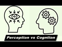
After years of beta testing and research, Shaver-Troup was able to determine that the reading issues she saw were indeed with perception rather than cognition. Lexend had shown its efficacy in studies, and in 2017, Shaver-Troup partnered with Google[i] to make an online variable-font solution available for every reader with the goal of improving retention and comprehension.
Initially, Lexend was designed with dyslexic and struggling readers in mind, but it soon became clear that others stood to benefit from these fonts as well. They are clear, reduce visual stress, and allow for more efficient reading than other standard fonts. While this is beyond helpful – necessary, some might say – to readers who are dyslexic or simply struggle to read, it also creates a more pleasant reading experience for normative readers.
Inclusivity on its (Type)Face
It was important to the SenseIT team that our website be accessible to every user that visits it, and that’s why we chose Lexend as our font – a typeface proven to improve reading proficiency for all. In keeping these small details in mind, we remain consistent in our value of inclusivity, and we hope to continue to do so in both big and small ways.
[i] Google Fonts is an initiative of Google to “make the web more beautiful, fast, and open through great typography and iconography.”
[i] LEXEND (All capital letters) is the name of the company. Lexend (lowercase letters) is the name of the font series.
[iv] Source: LEXEND’s website
[i] Source: Tracy, Walter (1986), Letters of Credit, Gordon Fraser
[i] Source: Eisenstein, Elizabeth L (1980), The Printing Press as an Agent of Change, Cambridge University Press
[ii] Source: Clair, Kate; Busic-Snyder, Cynthia (2012). A Typographic Workbook: A Primer to History, Techniques, and Artistry. John Wiley & Sons. pp. 4, 123
This may also interest you

Senseit
12 Examples of Assistive Technology (AT) That Went Mainstream
3/6/2023

SenseIT
ARIA in Action: The Authoring Practices Guide
1/4/2023

SenseIT
Digital Accessibility and Improving Your ESG Score
10/4/2022
